Pictures
To someone who wants to deceive, a picture
is worth far more than a thousand words.
Graphs and maps can be shaded, stretched,
artified to give any kind of impression at all.
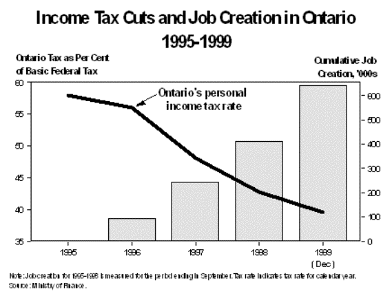
Take a look at this graph, courtesy of Ontario's
neoconservative government. The idea is to show that their tax cuts, rather
than destroying the public education system and health system, have 'created
jobs'.
Okay, by now I hope we've learned what to
read first?
The fine print, of course. It says:
"Note: Job creation for 1995-1998 measured for the period ending in
September. Tax rate indicates tax rate for calendar year. Source: Ministry of
Finance."
So it looks like 100 000 jobs in 1995,
another 100 000 in 1996, another 200 000 jobs in 1997, and another 200 000 jobs
in 1998. Nice. But notice that it's 'job creation'. Were there any job losses
in this period? I didn't see the word 'net' anywhere. How do I know more jobs
weren't lost in those years? It's also 'cumulative job creation', so that the
bars keep getting bigger and bigger each year, no matter how little job
creation there might actually be.
Okay, forget that. The bar on the right
side, the axis, is measured in 100s of thousands of jobs created. What was the
base level? I mean, if there are a million and a half people unemployed or
three million unemployed, six hundred thousand new jobs can make a big
difference or a small difference. Why aren't they plotting the unemployment
rate instead? If you asked them, they would probably say that unemployment
decreased by ten percent, or something. By which they could mean it went from
11% to 10%, since 1% is 10% of 10%. Does that not make any sense? It's not
supposed to. By manipulating the base, you can make small changes look like big
changes.
If that wasn't clear, just look at the other
axis. The income tax rate, went down from 58% to 40% in 4 years. Wow. We were
paying 58% income tax? That's awful! Oh, no, it's not income tax rate. It's
"income tax as a percentage of basic federal tax." Am I supposed to
know what that means? I guess it means that the income tax is decreasing
compared to the federal tax. But couldn't that just mean the federal tax was
increasing?
Notice too that on this axis the graph only
goes from 40 to 60. If the graph's axis went from 0 to 100, that wouldn't look
too impressive at all, it would look like a pretty horizontal line.
What are they trying to do anyway, putting
two different kinds of data on the same graph with different units? All they're
really showing is that one was going down and one was going up. They could have
manipulated the graphs to make job creation look even higher, or the income tax
rate look even lower than it was, just by stretching things out. Watch this.
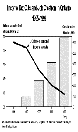
Wow. Don't those increases look impressive?
Now let's also forget that it doesn't talk
about what kinds of jobs are being gained. Let's also forget that their bizarre
'income tax rate as a percent of basic federal tax' might not have any
relationship to the money that is actually flowing out of most people's
pockets. (remember means and medians?) Let's also forget for now, that you can
plot one thing going down while one thing is going up and not prove a damned
thing about the relationship between the two. I could plot my age, in seconds,
and the temperature, from the late afternoon until midnight, on the same graph.
The temperature would be going down as my age went up. Then I could put it on a
graph and say: "Justin's age creates temperature decreases". Great.